The Display Container: GAO Architects’ Prefab Sales Solution in Ljubljana
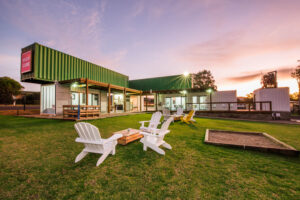
GAO Architects‘ Display Container in Ljubljana, Slovenia, redefined the traditional approach to real estate marketing by transforming a construction site into an engaging and accessible space for the public. Through the use of prefabricated containers, the project created a dual-purpose structure: the lower level featured an inviting display window showcasing materials and furnishings, while the upper level provided private workspaces for the project’s team. This innovative design not only served as an eye-catching sales tool but also reshaped how urban developments connect with the community during the construction phase, making the project more approachable and interactive.
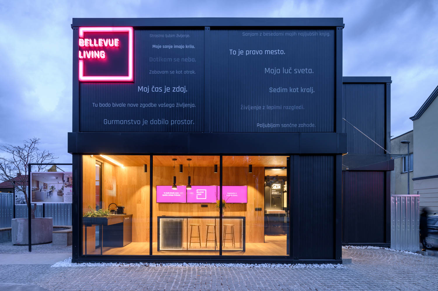
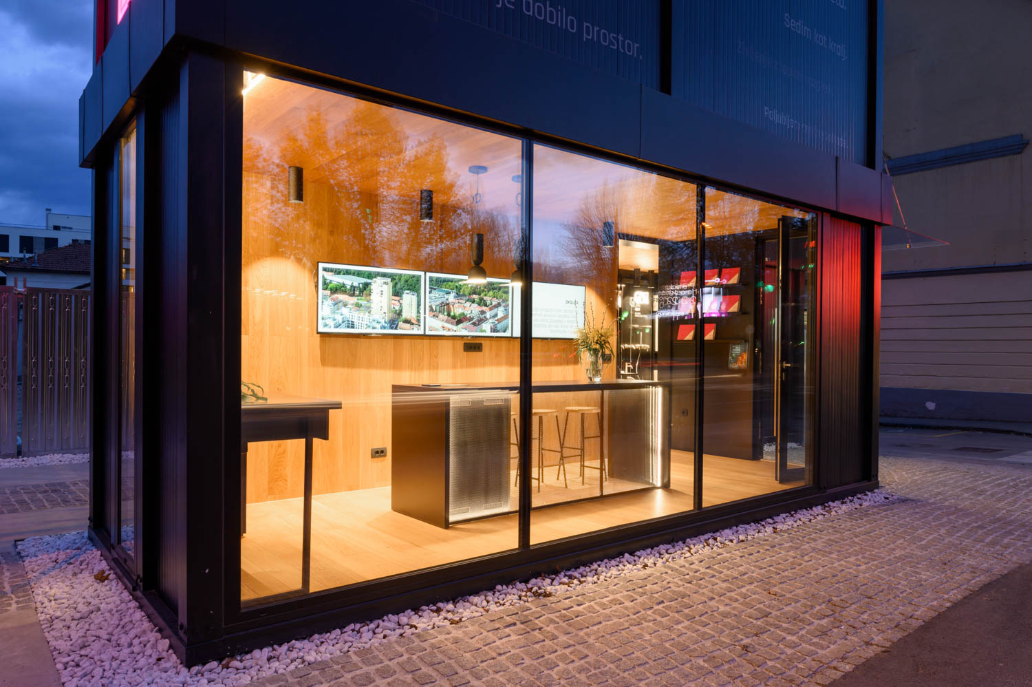
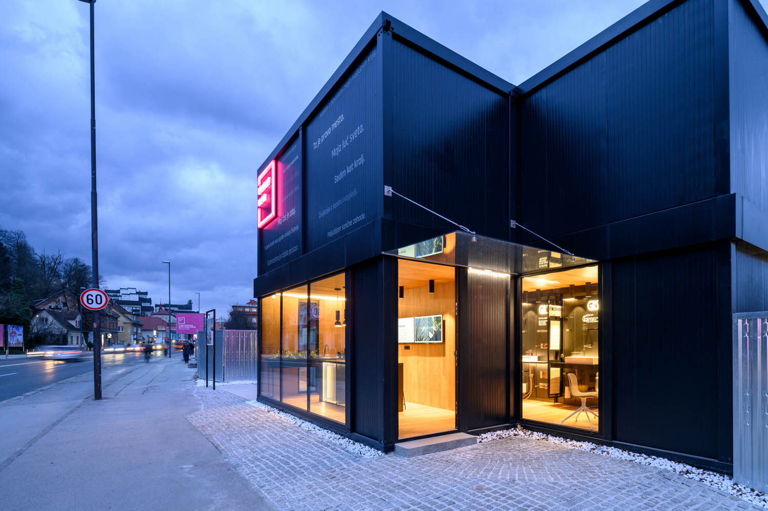
The Display Container offered an entirely new approach to the real estate market and the traditional apartment sale. Classic containers were placed in front of the building under construction and stacked into two storeys. The lower storey functioned as an alluring display window, fully opening onto the street and providing information to onlookers and potential buyers. The upper storey, however, was designed for personal use.
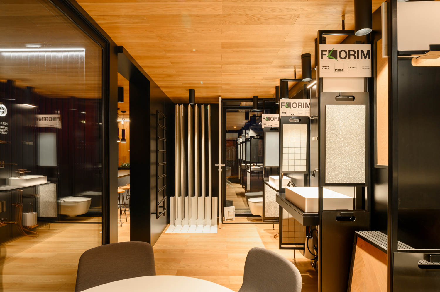
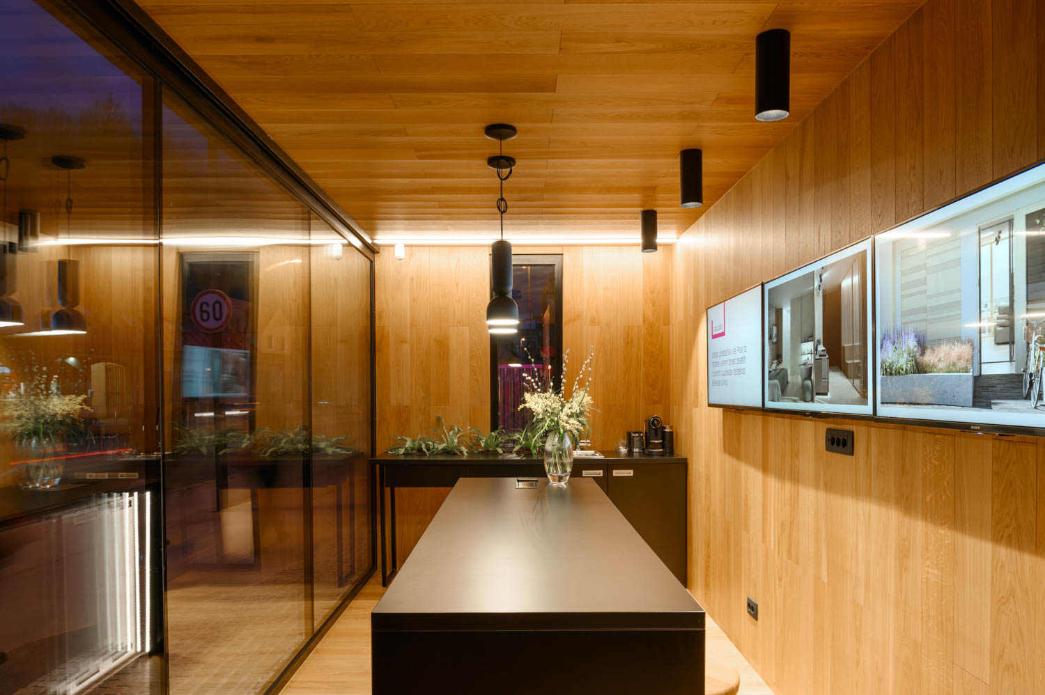
The illuminated display window invited visitors to enter, inquire about additional information, and inspect the sample room, where the project’s materials and furnishings were made fully available. The construction site was thus unobtrusively familiarized and brought closer to the public, while the newly-built volume was tactfully incorporated into the city.
Architects: Petra Zakrajšek, Tjaša Najvirt
Completion year: 2020
Location: Ljubljana, Slovenia
Investor: Bellevue Living
Photographer: Miran Kambič
Published with Bowerbird
GAO Architects chose a prefabricated container solution for the Display Container. What motivated this decision, and how does prefabrication align with your overall design approach for creating flexible and functional spaces in urban environments?
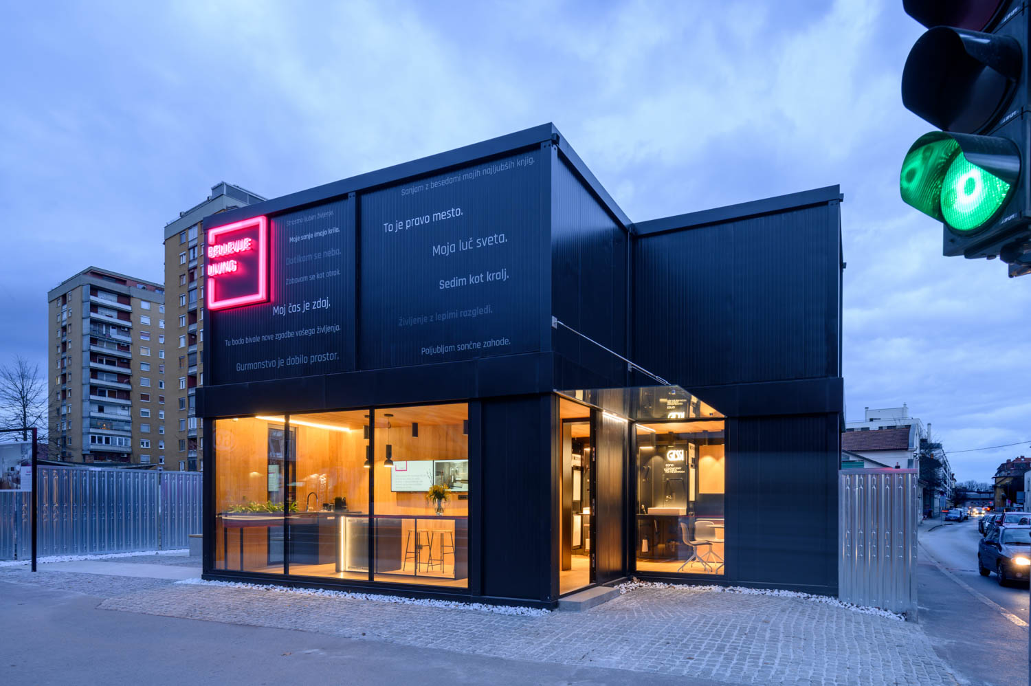
The container was positioned next to the main road in the construction site area and simultaneously served as both an advertising billboard and a sales office. Due to its placement, it attracted the attention of people passing by the street/city, while the brightly colored signage created a sense of surprise and interest.
Considering that we were looking for a temporary solution for the location of the sales office, the choice of a container was ideal. This solution is also sustainable, as it allows the investor to move the container entirely to a new construction site where it can again serve a similar purpose.
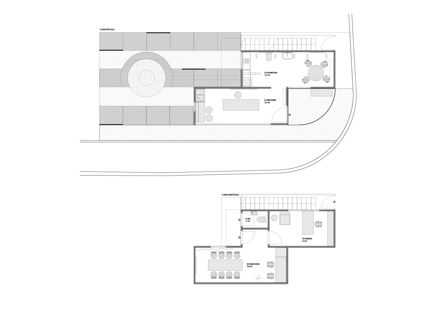
The two-storey container design offers distinct purposes for each level. Could you elaborate on the spatial design considerations for the lower display window versus the more private, personal use of the upper storey?
By offsetting two containers, we created a division of space into an entrance and reception area from the street, and a sales area with all materials displayed at the back. The two containers on the upper floor were accessible via stairs from the rear and did not open onto the street, as they were intended for use by the construction site (internal meetings, office for the investor, etc.).
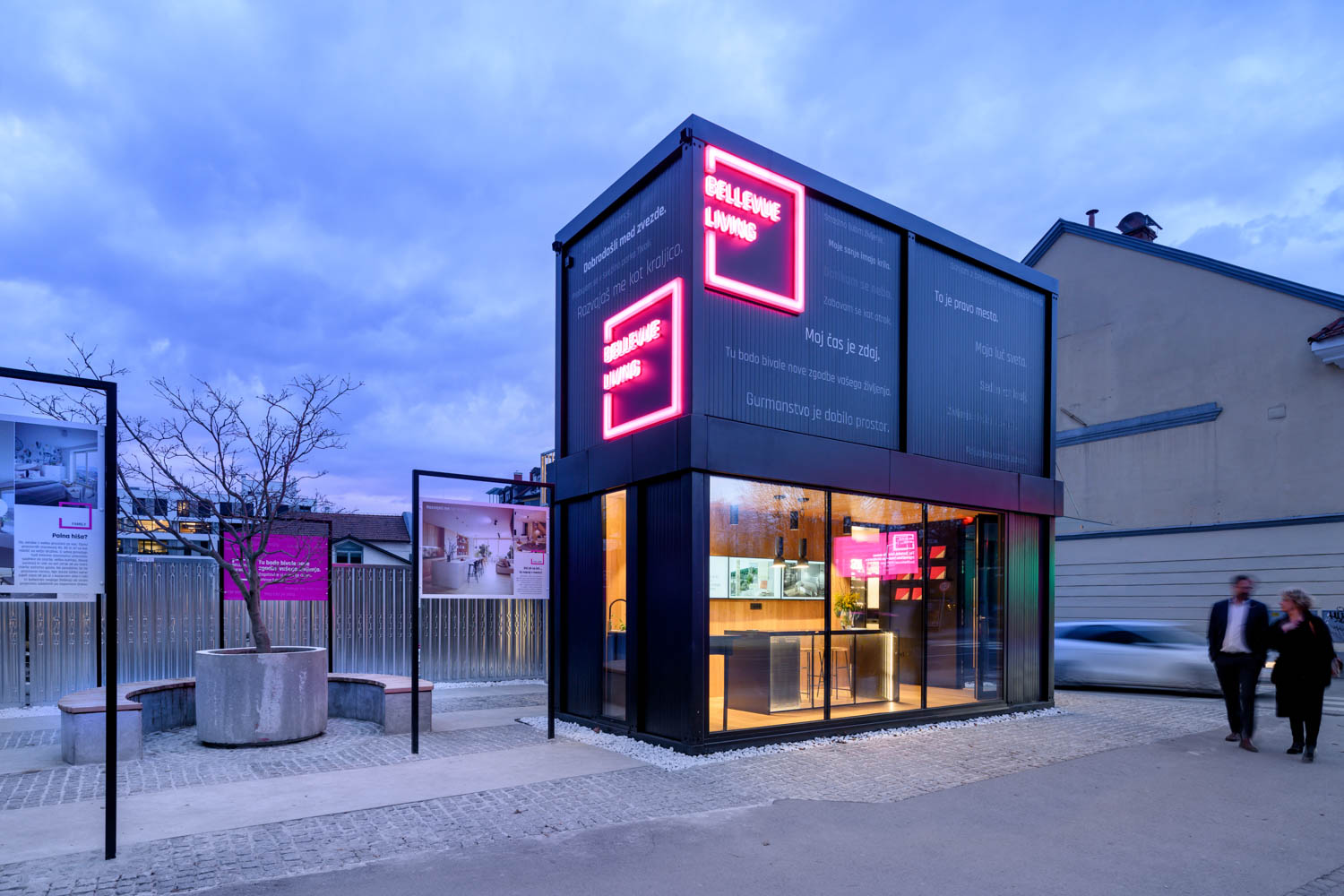
The illuminated display area plays a central role in engaging potential buyers. What challenges did you encounter when designing this space to be inviting and informative while seamlessly blending into the active construction site?
For this purpose, we were allocated a relatively small space. We positioned it on the far edge of the plot, where a traffic light was also located, which served as an excellent starting point, as traffic naturally slowed down at this spot. With a small urban intervention, we created an arrangement with display panels showing visualizations of the building under construction in the background. Typically, areas around construction sites are unwelcoming, even appearing dangerous, but here we wanted to slightly shift the concept. Our message was: “Come, everyone is welcome, we are building a project to enrich the city.”
GAO Architects is known for its attention to materiality and details. How did you approach the selection and display of materials and furnishings within the sample room to create a tactile and immersive experience for potential buyers?
Before the sale of the apartments, we worked with the investor to assemble possible selections of flooring, bathroom options (we had 5 variants), and consequently the choices for fixtures. There were limitations for buyers, but since we offered them not only visualizations but also well-arranged materials in thoughtful mood boards, they were able to easily choose one of the variants. A large part of the thinking and study of potential buyers was therefore done during the design phase of the building.
How has the public responded to this unconventional display concept, and what role do you see it playing in reshaping how real estate projects engage with the community during the construction phase?
This was one of the first attempts to bring the construction site area closer to the people. All involved were aware that such a large development could also be stressful for the public. We wanted to turn people’s resistance and fear of the new and unfamiliar into curiosity and a desire to explore the new. After all, the public programs on the ground floors of such buildings can only thrive if they are inviting and interesting to various age groups.
